In the good old days(for me at least) or for a very long time to come, background images are super cool and fun to aesthetically add images to your project with all sorts of renderings on top of it, be it text or maybe another image.
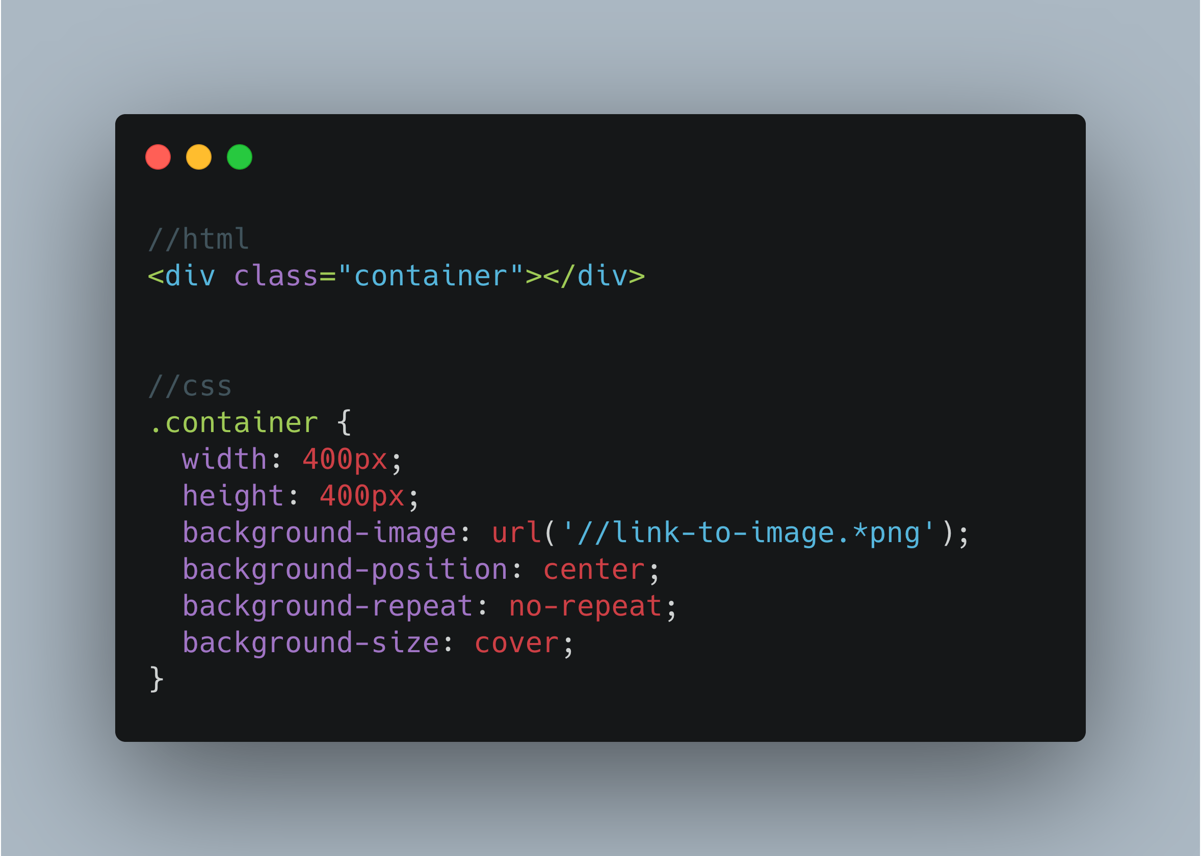
To get started, all you just needed to do was set a width and height for the container to hold the image and then play nicely with the background-image properties as seen below:

Smooth right? Well, yes but it means your image will be invisible to screen readers. Specifically if the image is actually relevant in the overall context of the design.
But have no worries, there's a super alternative that makes use of the HTML <img src="" alt="" /> tag and also the CSS Object-* properties which are the object-fit and object-position css properties. You can read up on them here.
The
object-fitCSS property sets how the content of a replaced element, such as an<img>or<video>, should be resized to fit its container.
Here's how to use it:
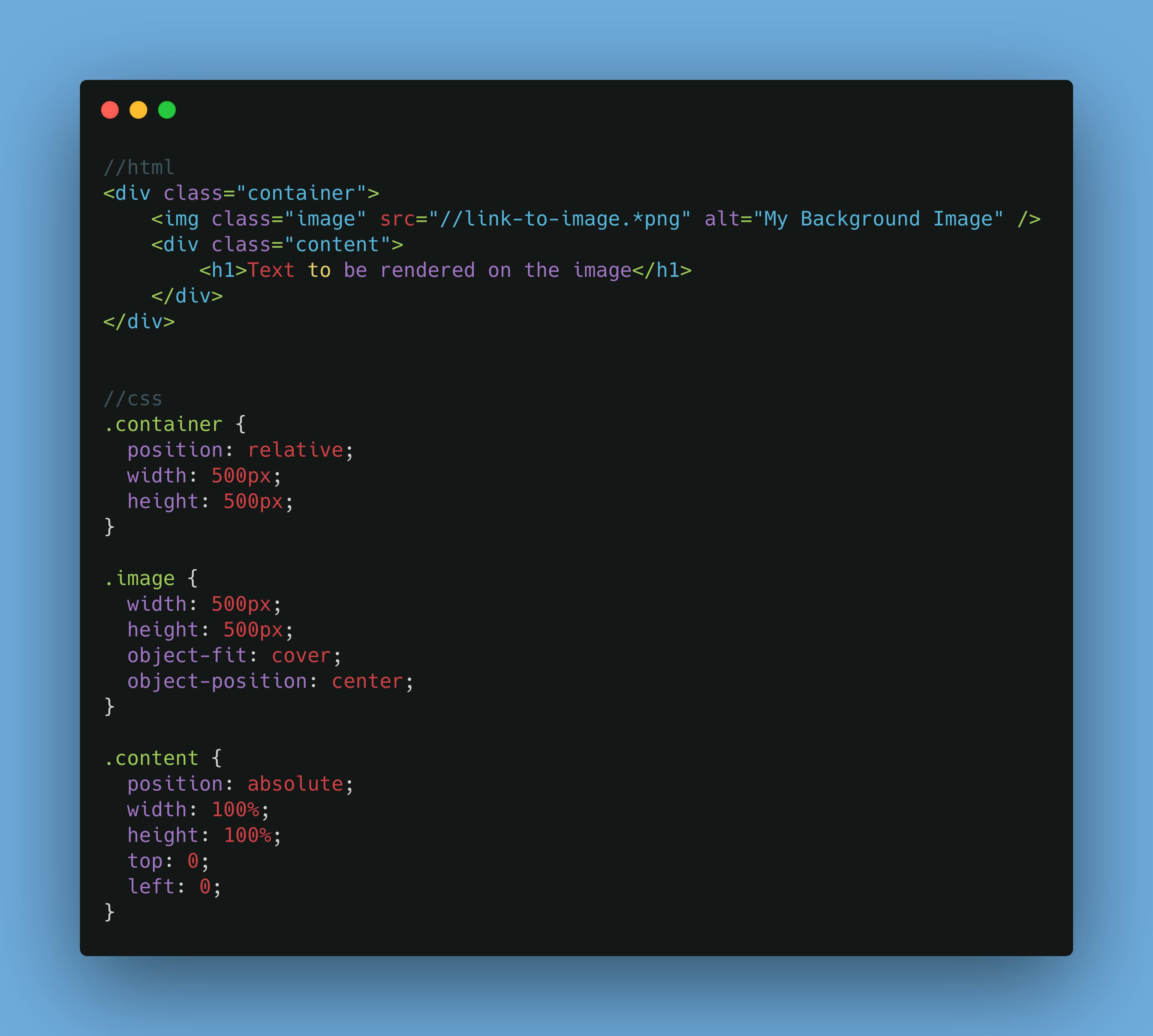
- Set the container and the image to the same width and height
- Define the
object-fitandobject-positionproperties to your taste on the image - Define the content area to hold whatever you want to appear on the image and position it absolutely
(position: absolute) - Apply other css styling as needed
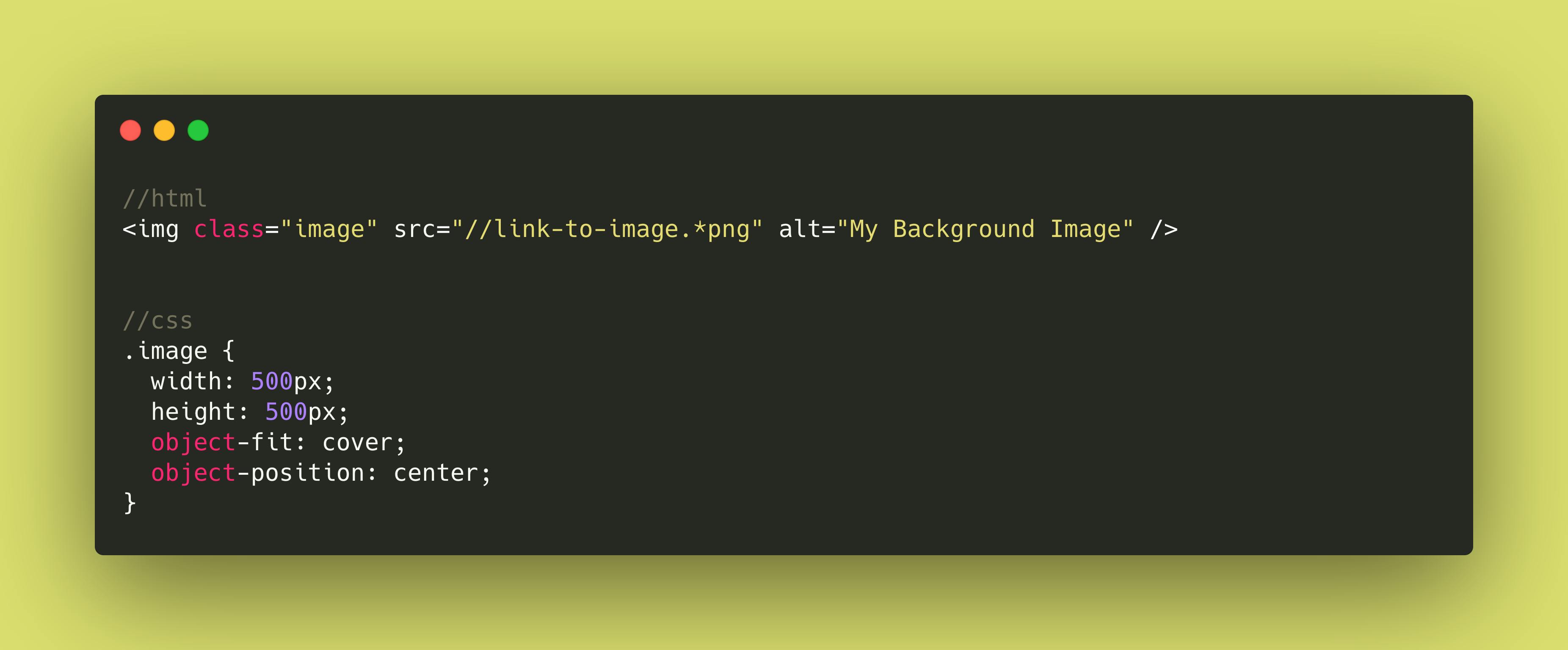
If you do not need this as a background image alternative, this is also useful rendering images to any size regardless of the size of the image itself while avoiding visually unpleasant distortions. All you need to do is define the width and height of the image and apply the object-fit and object-position properties to your taste as seen below:

I hope you find this a good read. Ed.


